Round Table: Shades of meaning
Talking about colour
MODERATED BY SARAH TURKENICZ
BIOS/
ADRIAN GÖLLNER IS AN ARTIST INTERESTED IN HEIGHTENING THE VIEWER’S SENSE OF SELF THROUGH TRANSPOSING ELEMENTS OF SOUND, TIME, AND MOTION. IN AN ART PRACTICE THAT EMPLOYS A WIDE RANGE OF TECHNIQUES AND MEDIA, GÖLLNER DIVIDES HIS TIME BETWEEN CREATING SMALL, CONCEPTUAL WORKS IN THE STUDIO AND IMPLEMENTING PUBLIC ART COMMISSIONS AT A MUCH LARGER SCALE. GÖLLNER HAS RECEIVED 20 PUBLIC ART COMMISSIONS, INCLUDING FOR THE VANCOUVER 2010 WINTER OLYMPIC GAMES, THE SIXTEEN TOWERS OF CITYPLACE IN TORONTO, AND THE CANADIAN EMBASSY IN BERLIN. GÖLLNER RECEIVED A BFA FROM QUEEN’S UNIVERSITY IN 1987 AND AN MFA FROM THE UNIVERSITY OF OTTAWA IN 2016. WHILE MAINTAINING HIS ART PRACTICE IN OTTAWA, HE HAS CONTINUED TO ADVOCATE FOR ARTISTS’ RIGHTS AND HAS SERVED ON THE BOARDS OF A NUMBER OF LOCAL GALLERIES.
ERIC KLAVER, OALA, IS CHAIR OF THE GROUND EDITORIAL BOARD AND A PARTNER AT PLANT ARCHITECT INC.
MARK LAIRD IS AN ASSOCIATE PROFESSOR IN THE DANIELS FACULTY OF THE UNIVERSITY OF TORONTO, WHERE HE TEACHES AN UNDERGRADUATE COURSE ON NATURAL AND CULTURAL HERITAGE AND A GRADUATE COURSE ON PLANTS AND DESIGN. FROM 2001 TO 2015, HE WAS SENIOR LECTURER IN LANDSCAPE HISTORY AT THE GRADUATE SCHOOL OF DESIGN, HARVARD UNIVERSITY. AS A TORONTO-BASED CONSULTANT IN HISTORIC LANDSCAPE CONSERVATION, HE ADVISES ON SITES IN EUROPE AND NORTH AMERICA. FOR HIS REPLANTING WORK AT PAINSHILL, IN ENGLAND, LAIRD WAS JOINT RECIPIENT OF A 1998 EUROPA NOSTRA MEDAL. HE HAS BEEN ASSOCIATE DIRECTOR OF PAINSHILL PARK TRUST SINCE 2004. HIS RESEARCH ON 18TH-CENTURY PLANTING IS PRESENTED IN HIS BOOK THE FLOWERING OF THE LANDSCAPE GARDEN (1999). EDUCATED AT THE UNIVERSITIES OF OXFORD, EDINBURGH, AND YORK, HE WAS RESEARCH FELLOW AT CHELSEA PHYSIC GARDEN IN LONDON AND TWICE A FELLOW AT DUMBARTON OAKS, WHERE HE SERVED AS A SENIOR FELLOW (2008-14). AFTER CO-EDITING MRS. DELANY AND HER CIRCLE (2009) FOR A YALE CENTER FOR BRITISH ART EXHIBITION, AND WITH A SENIOR FELLOWSHIP FROM PAUL MELLON CENTRE IN LONDON, HE COMPLETED HIS NATURAL HISTORY OF ENGLISH GARDENING IN 2015.
JAMES MACGILLIVRAY IS A PRINCIPAL AND FOUNDER OF LAMAS. HE HAS PUBLISHED WIDELY ON FILM, ARCHITECTURE, AND PROJECTION. HE IS FROM TORONTO AND RECEIVED HIS MASTERS IN ARCHITECTURE FROM HARVARD’S GRADUATE SCHOOL OF DESIGN AND HIS B.A. IN ARCHITECTURE FROM PRINCETON UNIVERSITY. PRIOR TO FOUNDING LAMAS, HE WORKED AS A DESIGNER AT STEVEN HOLL ARCHITECTS AND AS A PROJECT MANAGER AT PETER GLUCK AND PARTNERS ARCHITECTS. ALONGSIDE HIS WORK AT LAMAS, JAMES IS ALSO A LECTURER AT THE UNIVERSITY OF TORONTO.
LYNNETTE POSTUMA, OALA, IS A LANDSCAPE ARCHITECT WHO DABBLES IN PUBLIC ART. CURRENTLY THE PROJECT MANAGER FOR THE BENTWAY PROJECT AT WATERFRONT TORONTO, SHE HAS ALSO WORKED AT WEST 8 (EAST BAYSIDE, QUEENS QUAY) AND JANET ROSENBERG & STUDIO (GUELPH MARKET SQUARE, PARC DOWNSVIEW PARK). HER CREATIVE WORKS BRING ATTENTION TO EPHEMERAL MATERIALS SUCH AS AIR AND WATER, GROWTH AND DECAY, LIGHT AND SHADOW. FOLLOWING A PUBLIC COMPETITION, SHE RECENTLY COMPLETED A 12,000-SQ-FT MURAL ON THE WEST TORONTO RAILPATH. SHE HAS ALSO WORKED ON COMMISSIONED MURALS, ART INSTALLATIONS, AND TEXTILE PROJECTS.
SARAH TURKENICZ HAS A DOCTORATE IN ANTHROPOLOGY AND IS A STUDENT IN THE MLA PROGRAM AT THE DANIELS FACULTY, UNIVERSITY OF TORONTO. SHE IS A MEMBER OF THE GROUND EDITORIAL BOARD.
Sarah Turkenicz (ST): How does colour bring meaning to and inform your work?
James Macgillivray (JM): Colour is something our firm is becoming more and more comfortable working with. Initially, we rarely used colour, and our work was mostly monochromatic. But then we did a competition entry for MoMA’s Young Architects Program and, at the time, I was teaching studios about op art, so we went overboard and tried our hand composing with colour.
Lynnette Postuma (LP): I would call myself a colour convert. I’ve always been intimidated by colour, actually. It is only through recent projects that I’ve given myself the challenge to wrestle with colour and learn more about colour theory.
Adrian Göllner (AG): As a conceptual artist, if I use colour it falls pretty directly from an idea. There’s a logic to it.
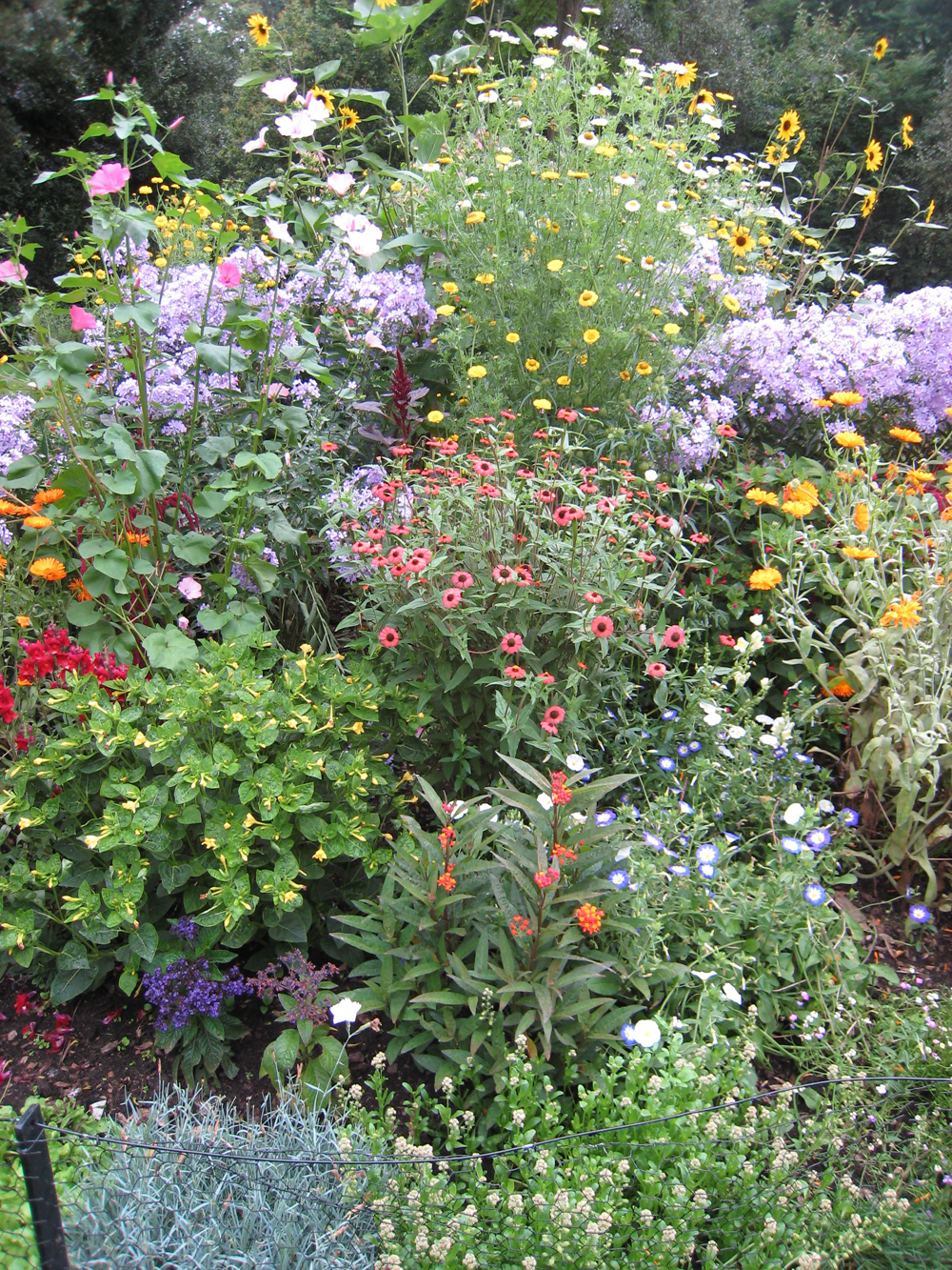
Mark Laird (ML): The historical roots of landscape architects’ difficulty with colour relate back through the Italian Renaissance, or French Baroque, to surviving English picturesque landscapes. These landscapes had lost all the original colour of flowers and shrubs, because such colour was ephemeral, and so it was assumed in the 20th century that they were designed with only the gradations of green in mind. Yet 18th-century aesthetics dictated that there must be colour in the landscape (to correspond to the love of colour in interiors, in textiles, etc.). It has been a challenge for historians to undo the misconceptions that landscape architects developed by their judging what had survived in shades of green as true to the original. Moreover, in the 19th century, when colour theory came in, all kinds of conceptual issues arose for landscape architecture, because Victorian plantings were garish and, as part of horticulture, were anathema to early modernists.
If you think about 17th-century Dutch painting, small units of colour were spread across the canvas, and that’s what baroque and picturesque flower beds looked like. It’s only with 19th-century colour theory that you get massing and complementary contrast. Obviously, this has its corollary in terms of early-20th-century painting, such as colour fields painting. Artists were not at all bothered by very bold blocks of colour, but modernist landscape architects generally struggled with the legacy of a colour massing associated with horticulture, for horticulture was suspect in the eyes of the emerging profession.
AG: Historically, when there was a movement away from colour, colour was viewed as indulgence. Colour was seen as temporary and, therefore, suspect.
ML: Yes, that is part of it. Frederick Law Olmsted had a dispute with his horticulturist about whether ephemeral colour should be part of permanence. Olmsted thought that once his designed landscapes were established for the long term, supporting his vision, then colour was extraneous and should be eliminated. He viewed colour as just transitional. Perhaps there is an element in this idea that comes out of a religious viewpoint about the frivolity of colour, and I think that Olmsted, being heir to a Puritan tradition, saw colour as troublesome this way.
In her fantastic book Frederick Law Olmsted and the Boston Park System, Cynthia Zaitzevsky recounts an 1889 dispute regarding the Overlook area of one of Olmsted’s parks in the “emerald necklace” of the Boston parks system. Olmsted’s horticulturist, Fischer, was clinging to his perennial and annual flower displays, but Olmsted tried to coax him out of that way of thinking: “As to the question of good taste, we often see ladies very splendidly dressed with jewels and bright ribbons and flowers and agree that it is in good taste. We see other ladies dressed quietly without jewelry or any finery of color or material, and we agree that they are also dressed in good taste. If the difference between us is a difference between two ideas, each of which is in good taste, then I think I have the right to ask you to adopt my more modest rather than your more splendid preference.” Evidently Fischer came back at Olmsted, slightly hurt, saying that he only meant to show nature in “holy day dress.”
For Olmsted, flowers were not primary, especially with the professionalization of landscape architecture in urban contexts. The shrubs and the trees would be his enduring legacy—100 years or 200 years from the design’s inception.
Eric Klaver (EK): The idea of texture and monochromatic planting has become key to modern landscape architecture.
ML: This also has to be put into the context of the dominance of horticultural thinking, in Olmsted’s time, which was about the bright, brash colours of what were called “bedding plants.” That was the locus of a real dispute between Olmsted (and his followers) and the horticulturists. This is quite useful background before we even get to modernism, and the disappearance of the ephemeral when flowers don’t last long.
LP: As landscape architects, we think relationally, and that’s an interesting way to think about colour. How we perceive colours is influenced by the adjacencies of other colours. Our language of colour is quite limited. We only have a few words for it, but the range of perceived colour is so much deeper.
ML: This ties in with something that is not strictly about colour, and that is ecology. Ecology leads to a different way of thinking about what is happening in various environments and, as a result of that, to designers who are obviously concerned with relationships, systems, and performance. Modeling planting systems according to ecological systems may lead to sensibilities that are not so far removed from 18th-century aesthetics.
If you look at the work of designers such as Piet Oudolf, Noel Kingsbury, or the Sheffield group of designers, you see a return to a mixed palette, or “intermixing,” which doesn’t mean there isn’t any colour theory. It is simply that they are looking to meadows or prairies for one inspiration just as picturesque theorists began with what they called the natural “embroidery” of meadows and wheat fields. These designers today see such fine points of colour almost like pointillism. This corresponds, as it happens, to the aesthetics that existed within design before landscape architecture, before 19th-century colour theory, and before Olmsted.
JM: I almost feel as if, in the pointillist mode, with those individual pieces of colour, there’s not enough of them to get any momentum to be able to do what colour theory does, which is like a field of orange next to a field of blue. They start to vibrate.
ML: But you can do that by selectively taking California poppy as bright orange, and then mixing it in with cornflowers, for example, which are a bright blue. So, selectively, you can arrive at effects vibrant enough for that momentum to work as a painterly effect rather than according to colour theory.
LP: The English gardens of the 18th century and Piet Oudolf’s designs in recent years really correspond with painting modes and styles, more so than with colour theory. You can see the small brush strokes of English gardens versus the broader, longer brush strokes and mass plantings of Piet Oudolf. And that, to me, is more stylistically akin to painting and the fine-art world.
ST: How does your perception affect the use of colour in your work?
JM: It’s hard to confirm that everyone has the same perception of colour, that these colours we’re talking about are actually the colours we agree they are. The test is subjective. A lot of the assumptions of colour theory have recently been proven incorrect by MRI technology. The mechanics of colour in the brain is quite mysterious. So, in a sense, what we have is a cultural understanding of colour. And we use that in our work.
AG: Red, as a colour, is culturally quite different, depending on context. Think about North America’s idea of a red-light district, whereas red in Asian culture is often very lucky. But it’s a very active colour and difficult to use just by itself. The colour blue, though, is generally very welcome. (Blue is often used to light back alleys in Vancouver because then people can’t see their veins and shoot up.)
JM: I’ve been researching digital film a lot, and blue is sort of like the underlying colour of all digital media. But that’s why it’s so dangerous to us… There is a receptor in the human eye that goes directly back to something that controls your circadian rhythm, so if you look at your phone before bed, it can disrupt your sleep.
LP: I’ve been reading Kassia St. Clair’s book The Secret Lives of Color. It’s a wonderful book full of stories about colour over the years. At one point in the 14th century, it was decreed that peasants couldn’t wear anything but colours of the earth, russets etc. And so, the wearing of colour would identify the status of a person. Reds and blues signified royalty.
Today, we’re inundated with colour, but I think the rules have opened up, especially culturally. I don’t think there are the cultural stereotypes around colour that used to exist.
JM: There still seems to be a bit of fear about using colour in projects, though.
Sometimes we’ll use a colour that’s very trendy. In one of my projects, we’re using pink, which is big now. But in a couple of years, maybe it won’t be. And that’s interesting in relation to gardens, because with horticulture, you can depend on things fading away if you don’t attend to them. Everything fades into an all-green garden if you’re not careful to maintain the flowers.
ML: From an historian’s point of view, there are colours that are fashionable one year, but out of fashion the next. Colour can date a work very quickly. But one of the interesting things about working in the heritage sector is that you’re forced to re-evaluate your prejudices about colour. Something might not be to your taste, or might have been criticized in its time period, but it’s very interesting to learn to accept other ways of looking at colour rather than accepting what comes to you instinctively or through subjective preferences.
EK: Paint companies try to connect colours to specific things, in the names they use…like raccoon fur, or pewter, or things like that.
ML: Pink is an interesting example, because it’s tied to a flower which is called the pink. But pink is not a word that was used in 18th-century colour thinking. It was considered a variation on red, or blush, and so on.
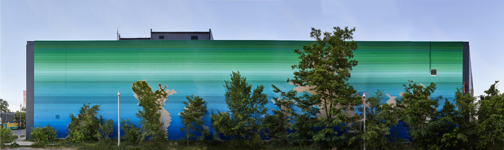
EK: Lynnette, could you speak about your West Toronto Railpath project?
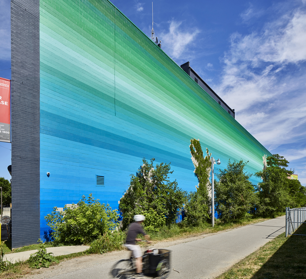
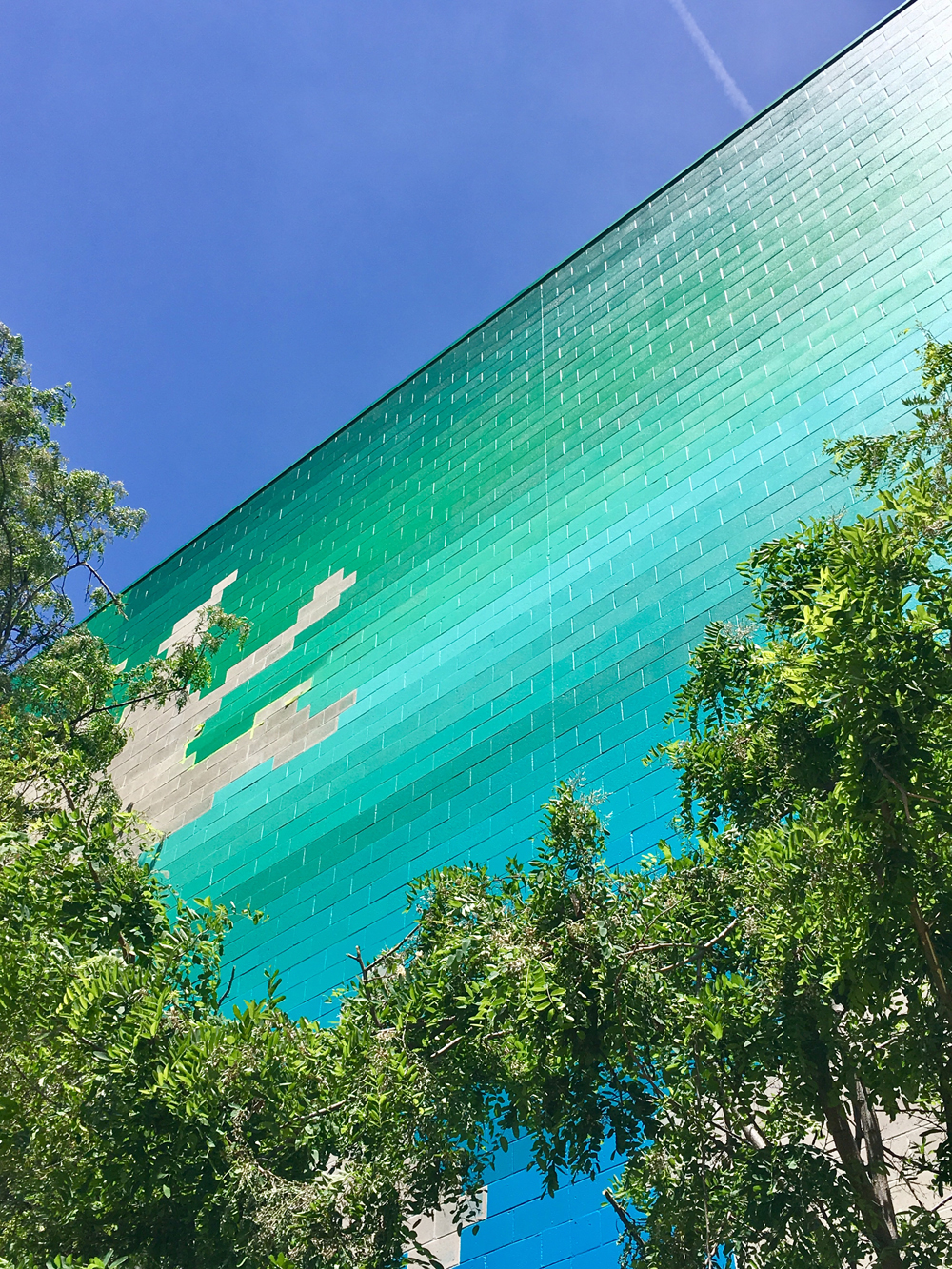
LP: The mural project is called Gradation, and it’s a stylized gradient, essentially, moving from blue to green. The colour takes an outline of the existing vegetation in order to become a growth marker, so you can see the progress of vegetation as it grows on or adjacent to the wall over time.
I constructed a gradient, digitally, but then it came down to paint chips—a million of them. Through mixing standard paint colours, and adding and subtracting, I came up with the 37 versions of colour that are on this wall. It is large, about 12,000 square feet, and uses the building material—the cinder block—as the organizing element.
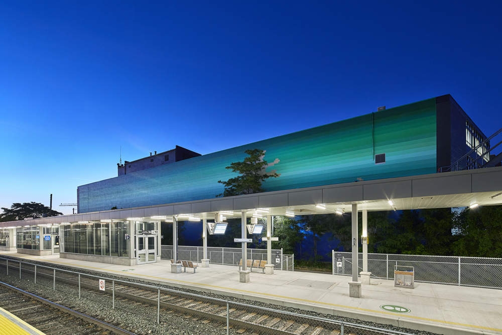
The best part for me was experiencing this view, after the fact. As a landscape architect, I think relationally between buildings or objects, but this project surprised me in ways I didn’t expect—particularly in the ways that light and colour can bounce off reflective surfaces three or four times. The mural becomes an immersive experience along the West Toronto Railpath, and that doesn’t happen all the time.
EK: What about your choice of colour, from green to blue?
LP: The history of the site informed the colour progression. The area has always been a route of conveyance. We know it now as a walking and cycling path, but in the last century or two there was the rail line. And before that, this region was known as the Toronto Carrying-Place Trail—a portage and trading route for Native Peoples and also the early settlers. The Mohawk term “toron-ten,” meaning “the place where the trees grow over the water,” refers to this past and present history by informing the colour progression.
In my piece, it’s the trees, the green, above the water, instead of what you would naturally think of as green vegetation and blue sky. I really wanted to invert that, and contrast the colours of paint against the existing elements.
ST: Is there a space, place, or environment where the experience of colour is inspirational or exceptional to you?
JM: In architecture and landscape architecture, where our client-based practice makes it hard for us to express ourselves with colour, most of my inspiration comes from the fine arts, particularly installation artists such as James Turrell, or painters such as Barnett Newman.
LP: Nature is the obvious choice for inspiration. I’m thinking of the colours of the seasons, even in winter. Snow, which you think is white, turns blue the deeper you go—it’s just amazing. Or the first tree buds in springtime—the colour is electric green.

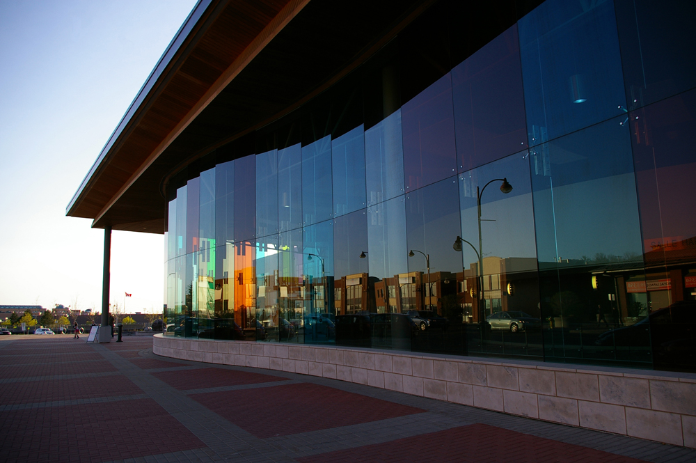
AG: I often remark about colour when there’s really poor colour. If I go into an old building where there’s very poor fluorescent lighting, and there are whole wavelengths of light missing, I know what colour should be there, but there’s a dissonant relationship between what I know and what is being represented. You get that with LEDs as well, where sometimes they’re very specific colours and they’ve knocked out other ones. At some places in the urban environment, poor colour speaks loudly at times.
JM: There’s an interesting piece by Olafur Eliasson in the Museum of Modern Art in New York City, where he took the sodium lights that are usually in parking lots, and he did a whole room with them. Sodium lights are very, very pure. They have only one frequency of light they emit. So, in this room, you have a very strange feeling that you are in a black-and-white photograph. Anything that isn’t light is turned into a gray scale.
ST: Is there a no-go area when it comes to colour? Are there things you won’t do with colour?
AG: This applies to almost any element of the arts: things that are obvious quickly become tired. If the colour is relatable to other elements and has a conceptual relationship, then it tends to last. If the colour is simply decorative, it may be victim to fashion very, very quickly.
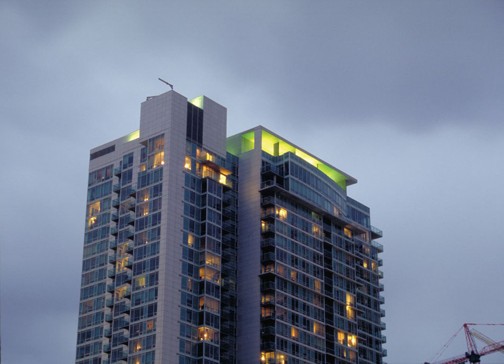
Texture and colour, illuminated colour, and being able to provide variety, the way colour and light can refract off of something—these can add enduring interest. My experience with the lighting on the City Place project, and in other projects, has been that we invite reflection off of objects as a way to add variety and interest and shadow, so that the eye has something to play off longer.
JM: In our practice, we try to stay away from the idea that there is a no-go area with colour, because it restricts our creativity. But we also try to avoid colour that has no reason or purpose—for example, having an aluminum curtain or façade with green spandrel glass that doesn’t have a larger purpose. We always try to involve colour in some kind of system that we take time to compose. If you put time and decision-making towards any end, usually there’s the gestalt of a rigorous process that ends up being visible with any crafted thing that you’ve done. So, thoughtless colour would be the only no-go situation.
LP: Le Corbusier was all about form, and he talked about colour as a distraction. Surface colour is the fad that he warned against. Here we are, a hundred years later, and we still want the authenticity of our use of colour. It has to have meaning.
JM: But at the end of the day, you have to be comfortable with subjectivity and with the fact that it could all be arbitrary.
There’s another aspect to this: can colour simply be about manipulating mood? Sometimes I want to be in a better mood! So I’m comfortable with that…
One thing about colour that I try to be sensitive to and yet that I find really hard to wrap my head around, is that we only perceive colour in a very small part of our eyes, and that a lot of what we see is a result of our brains colouring in a line drawing. The real power of colour is the fact that it’s expensive, neurologically speaking. The cones are extremely expensive for your eye, and they take a lot of computing power. Your brain is filling in the gaps, and that’s the powerful thing about colour: it is largely constructed by the brain on an instantaneous basis.
THANKS TO KATIE STRANG AND ANDREW TAYLOR FOR THEIR ASSISTANCE IN CONCEPTUALIZING AND ORGANIZING THIS ROUND TABLE.