Artifact: A helping hand(rail)
Text by Glyn Bowerman
For most people, a handrail is a symbol of accessibility: ideally part of any staircase or ramp design, indoor or outdoor, for people with mobility issues, or just everyday safety.
But accessibility and safety features, included with the best of intentions, have to be done right, or you risk jeopardizing some people’s safety.
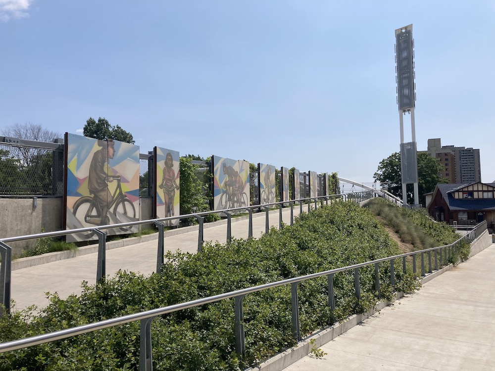
The pared down, raw material look remains pretty popular in modern design. It’s a style that often includes stainless steel, due to its resistance to corrosion and rust, durability, and relative sustainability. This is fine, but can pose an issue in the case of handrails.
The CNIB Foundation has a helpful resource for designing for people living with various visual impairments called clearingourpath.ca. Included in this resource is a guideline emphasizing the need for a high degree of colour contrast between handrails and the surrounding environment.
Certain visual impairments require this colour contrast for handrails to be visible. Black and white or dark red and white are listed as examples of good contrast. Red and green or blue and green are to be avoided to accommodate people with colour blindness. Stainless steel, or another grey metal material, is unlikely to provide great contrast since it tends to reflect the colours from its surrounding environment.
One retrofitting solution provided by Clearing Our Path is adding brightly-coloured decals to the top and bottom of a rail that doesn’t otherwise contrast properly with the background.
You may also consider coating the handrail with a surface that will provide better contrast.
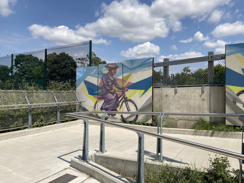
With governments at every level trying to meet the Accessibility for Ontarians with Disabilities Act guidelines, and with the Public Private Partnerships becoming more frequent, designers will be required to demonstrate their handrails provide the right amount of colour contrast to provide safety and accessibility.
If you’re designing a handrail, make sure it pops.
BIO/ Glyn Bowerman is the editor of Ground, a Toronto-based journalist, and the host of the Spacing Radio podcast on Canadian urbanism.